
Search Colleges, Exams, Schools & more


Login
The CAT DILR Graph topic tests a candidate’s ability to read, interpret and analyse data presented visually. Graph-based sets can include bar graphs, line graphs, pie charts and combination graphs, with questions based on percentages, ratios, averages, comparisons and trends. For CAT 2026, the exam is scheduled to be conducted on November 29, 2026. As the DILR section requires candidates to make quick decisions from complex data, understanding graphs and identifying useful information can help improve both accuracy and time management.
This Story also Contains
- What is a Graph in CAT DILR?
- Types of Graphs Asked in CAT DILR
- Important Concepts for CAT DILR Graph Questions
- Common Types of CAT DILR Graph Questions
- CAT DILR Graph Sample Questions
- Best Resources to Ace CAT DILR Section 2026

This article covers the key CAT DILR concepts, sample questions and practical preparation tips for solving CAT DILR graph-based sets.
What is a Graph in CAT DILR?
A graph in CAT DILR is a visual representation of numerical data used to test a candidate’s ability to extract, compare and interpret information. Graphs may present data through bars, lines, points or sectors, with values plotted against defined categories or intervals. In a typical CAT DILR set, you may need to read the x-axis and y-axis, identify the scale, compare data points, calculate ratios, percentages, averages or differences, and combine information from multiple graphs.
Types of Graphs Asked in CAT DILR
CAT DILR graph-based sets can present data in different visual formats, and each format requires a slightly different interpretation approach. Candidates should be comfortable identifying the scale, extracting values and comparing multiple data points before attempting calculations.
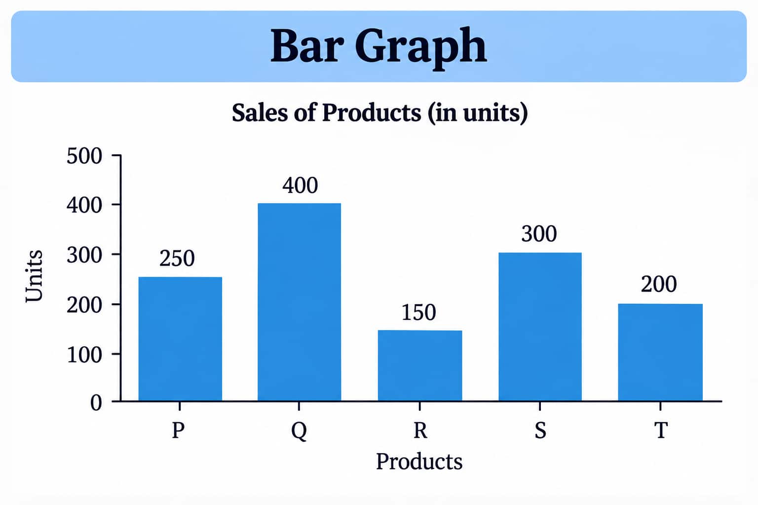
Bar Graph
Bar graphs represent quantities using bars of different lengths or heights. CAT questions may use single, double or multiple bar graphs to compare categories across years, groups or variables. Questions commonly involve totals, differences, ratios and percentage changes.
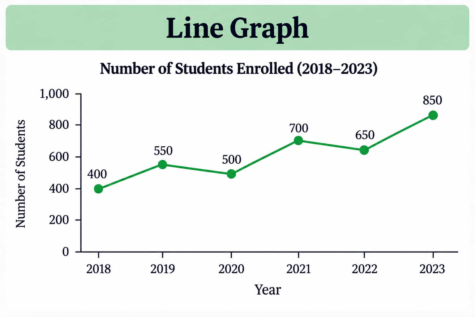
Line Graph
Line graphs show how a variable changes across an ordered scale, usually time. They are useful for analysing growth, decline, fluctuations and trends. Questions can require comparison between years, calculating changes or identifying periods with specific conditions.
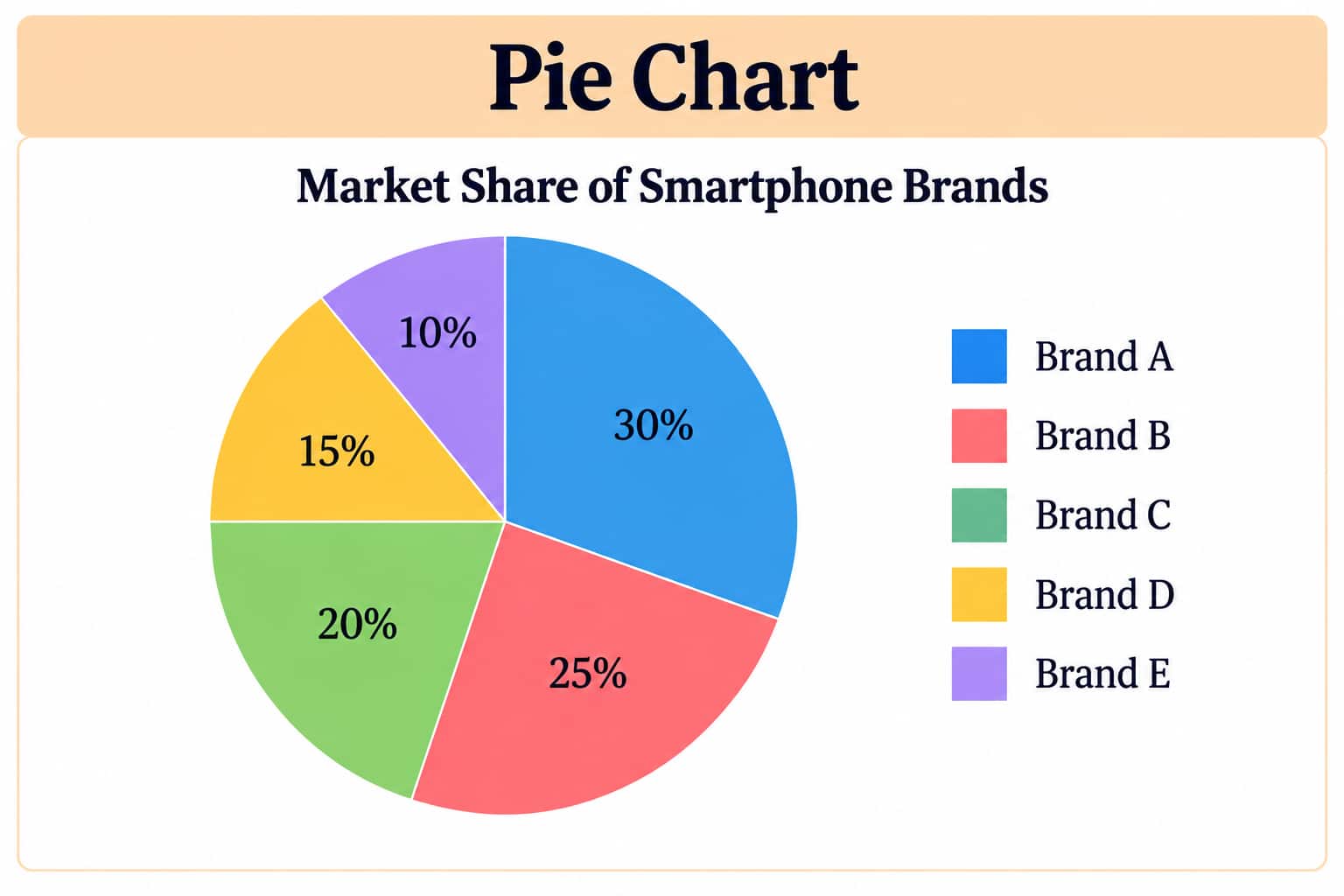
Pie Chart
A pie chart divides a whole into sectors representing proportions or percentages. CAT questions may require converting sector percentages into actual quantities, comparing categories, finding ratios or determining missing values.
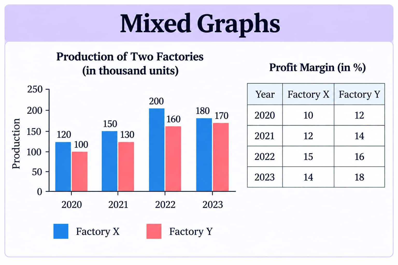
Mixed Graphs
Some DILR sets combine two or more forms of data, such as a bar graph with a table or a line graph with a pie chart. These sets require information from different representations to be connected before reaching the answer.
Important Concepts for CAT DILR Graph Questions
Graph-based DILR questions do not usually require advanced mathematics. The challenge is to read the visual data accurately, identify relationships and apply basic arithmetic without wasting time. Candidates should be comfortable with the following concepts.
Reading Scales and Axes
The x-axis generally represents categories, years or other independent variables, while the y-axis shows the corresponding numerical values. Always check the scale before reading a value. For example, if the y-axis moves from 0 to 100 in intervals of 20, a bar halfway between 40 and 60 represents 50, not 10 or 20. In mixed graphs, also check whether different graphs use different units or scales.
Percentage Change
Percentage change is frequently used to compare values shown in graphs.
Percentage Change = [(New Value − Original Value) / Original Value] × 100
For example, if sales increase from 240 to 300:
Percentage increase = (60/240) × 100 = 25%
A common CAT trap is using the new value instead of the original value as the denominator.
Ratio and Proportion
Ratio questions require candidates to compare two quantities in their simplest form.
For example, if two categories have values of 180 and 240:
Ratio = 180 : 240 = 3 : 4
In a pie chart or mixed graph, ratios may need to be derived from percentages, totals or values obtained from another data source.
Averages
Graphs may provide data for multiple years, categories or groups and ask for their average.
Average = Sum of all relevant values / Number of values
The key is to include only the observations specified in the question. For example, if the question asks for the average production between 2021 and 2023, values from 2020 should not be included.
Absolute Difference
Absolute difference simply measures the gap between two values:
Absolute Difference = |Value 1 − Value 2|
If production is 450 units for A and 320 units for B, the difference is 130 units. This is different from percentage difference or percentage change.
Percentage Points
When comparing percentages, distinguish between percentage points and percentage change. If a company's market share rises from 20% to 30%, the increase is 10 percentage points, whereas the percentage increase is:
(10/20) × 100 = 50%
This distinction can be important in CAT DILR options.
Weighted Average
When different categories have different quantities or weights, a simple average may give the wrong result. Use:
Weighted Average = Σ(Value × Weight) / Σ Weight
This becomes particularly relevant when a graph provides production, sales, prices or performance data alongside another variable.
Approximation
Not every calculation needs to be exact. When answer options are sufficiently far apart, approximation can reduce calculation time. However, candidates should avoid approximation when options are close or when the question asks for an exact ratio or value.
Comparing Trends
In line graphs, focus on the direction and magnitude of change rather than simply identifying the highest point. A graph may show an overall increase while containing one or more periods of decline. Questions can ask about consecutive growth, maximum increase, minimum decrease or a specific change over a period.
Common Types of CAT DILR Graph Questions
CAT DILR graph questions can test anything from direct data extraction to multi-step calculations involving more than one graph. The question may ask you to identify a value, compare categories, calculate a percentage or derive information that is not directly given. Common question patterns include:
Finding Values
Questions may ask for the value represented by a particular bar, point, sector or category. These are usually based on correctly reading the axis, scale, units and labels.
Finding Totals
You may need to add values across different categories, years or groups. In some sets, the total is not directly provided and must be calculated from the graph.
Comparing Categories
These questions ask you to compare two or more data points using difference, ratio or percentage. The categories may belong to the same year or different periods.
Percentage Change
A graph may show values across different years and ask for the percentage increase or decrease between two specified points. The original value must be used as the denominator.
Ratio-Based Questions
Candidates may be asked to determine the ratio between two categories or compare values represented in different parts of a graph.
Average-Based Questions
These questions require calculating the average of selected values from the graph. They may involve yearly data, multiple categories or values from more than one dataset.
Missing Value Questions
A graph may provide partial information along with a total, ratio or percentage. You must use the given relationship to calculate the missing value.
Trend-Based Questions
Common in line graphs, these questions ask you to identify periods of increase, decrease, maximum growth, minimum growth or fluctuation.
Data Combination Questions
These are more calculation-intensive questions in which information from a bar graph, line graph, table or pie chart must be combined. The required value may not be available directly in any single representation.
Statement-Based Questions
You may be given several statements and asked to determine which statements are correct, incorrect or cannot be determined from the graph. These questions test whether you can distinguish between what the data establishes and what it does not.
CAT DILR Graph Sample Questions
Category 1: Bar Graph Questions
Set 1: Single Bar Graph – Tech Solutions Annual Revenue
Dataset:
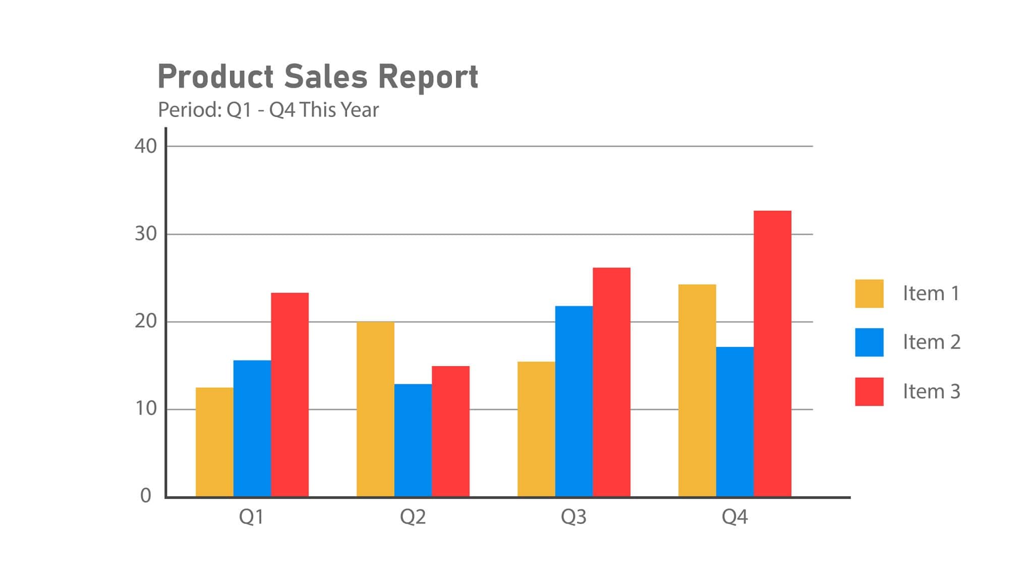
The bar graph shows the annual revenue (in ₹ Lakhs) of Tech Solutions over five consecutive years (2020– 2024 ).
Year | Revenue (in ₹ Lakhs) |
2020 | 120 |
2021 | 150 |
2022 | 180 |
2023 | 210 |
2024 | 250 |
Question 1
What is the difference between the revenue generated in 2024 and the revenue generated in 2020?
A) ₹110 Lakhs
B) ₹120 Lakhs
C) ₹130 Lakhs
D) ₹140 Lakhs
E) ₹150 Lakhs
Question 2
What is the total revenue generated by Tech Solutions over the five-year period from 2020 to 2024 ?
A) ₹890 Lakhs
B) ₹900 Lakhs
C) ₹910 Lakhs
D) ₹920 Lakhs
E) ₹950 Lakhs
Question 3
By how much does the sum of revenues in 2023 and 2024 exceed the sum of revenues in 2020 and 2021?
A) ₹180 Lakhs
B) ₹190 Lakhs
C) ₹200 Lakhs
D) ₹210 Lakhs
E) ₹220 Lakhs
Question 4
What is the ratio of the lowest annual revenue to the highest annual revenue in the given period?
A) 12 : 25
B) 3 : 5
C) 2 : 5
D) 12 : 19
E) 1 : 2
Question 5
If target revenue for 2025 is set at 1.2 times the average annual revenue of the previous 5 years, what is the target for 2025?
A) ₹212 Lakhs
B) ₹216 Lakhs
C) ₹220 Lakhs
D) ₹224 Lakhs
E) ₹230 Lakhs
Set 2: Multiple Bar Graph – Production vs Sales
Dataset:
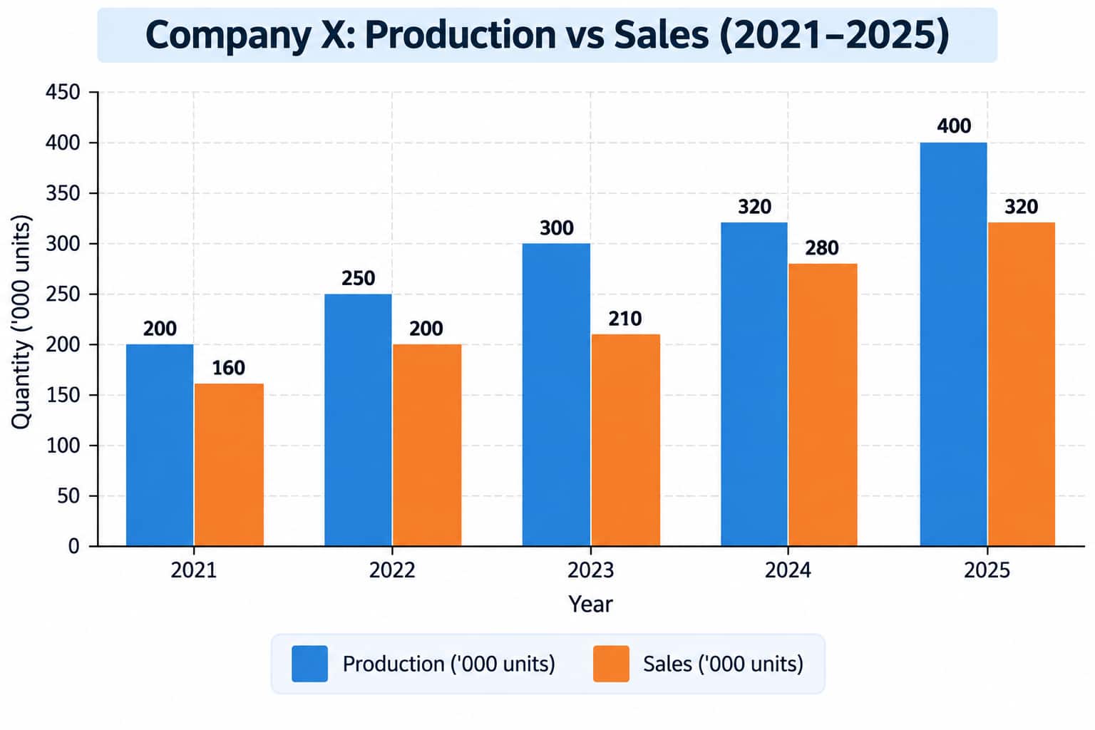
The stacked/grouped bar graph illustrates the production and sales (in thousands of units) for Company X from 2021 to 2025.
Question 6
What is the percentage increase in total production from 2021 to 2025?
A) 80%
B) 90%
C) 100%
D) 110%
E) 120%
Question 7
In which year was the ratio of sales to production the highest?
A) 2021
B) 2022
C) 2023
D) 2024
E) 2025
Question 8
What is the average unsold stock (Production minus Sales) per year across the 5 years?
A) 50 thousand units
B) 60 thousand units
C) 70 thousand units
D) 80 thousand units
E) 90 thousand units
Question 9
What is the ratio of total sales in 2021 and 2022 combined to total production in 2024 and 2025 combined?
A) 1 : 2
B) 5 : 9
C) 1 : 1
D) 3 : 5
E) 2 : 5
Question 10
If the selling price per unit was ₹500 in 2024 , what was the total sales revenue generated in 2024 ?
A) ₹12 Crores
B) ₹14 Crores
C) ₹16 Crores
D) ₹18 Crores
E) ₹20 Crores
Category 2: Line Graph Questions
Set 3: Year-Wise Trend Analysis
Dataset:
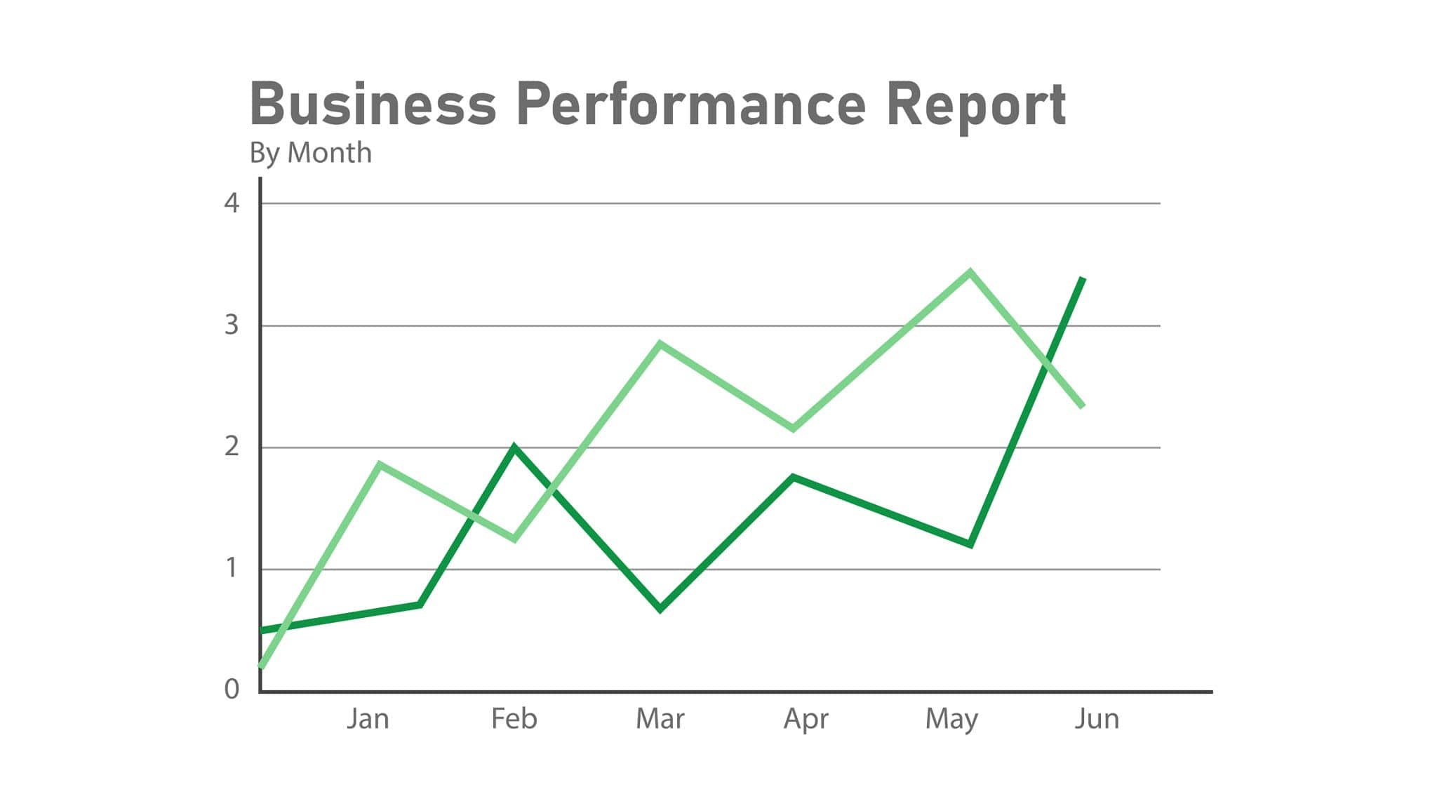
The line graph depicts the Monthly Active Users (MAU) in thousands for two mobile applications, App A and App B, over six consecutive months.
Month | App A MAU ('000) | App B MAU ('000) |
Jan | 40 | 20 |
Feb | 50 | 30 |
Mar | 45 | 50 |
Apr | 70 | 60 |
May | 80 | 90 |
Jun | 100 | 80 |
Question 11
In which month did App A experience the highest absolute month-on-month increase in MAU?
A) Feb
B) Apr
C) May
D) Jun
E) Mar
Question 12
Which month recorded the largest absolute gap in MAU between App A and App B?
A) Jan
B) Mar
C) Apr
D) May
E) Jun
Question 13
What is the percentage increase in MAU for App B from January to May?
A) 250%
B) 300%
C) 350%
D) 400%
E) 450%
Question 14
What is the ratio of average MAU of App A to average MAU of App B over the 6-month period?
A) 13 : 11
B) 65 : 55
C) 13 : 10
D) 26 : 21
E) 5 : 4
Question 15
In how many months was the MAU of App B strictly greater than that of App A?
A) 0
B) 1
C) 2
D) 3
E) 4
Set 4: Multi-Step Line Graph Analysis
The line graph tracks the quarterly percentage profit margin earned by Company Y across 4 quarters of 2025, alongside the total expenditure (in ₹ Crores). Profit Margin % Profit Percentage = (Profit ÷ Expenditure) × 100
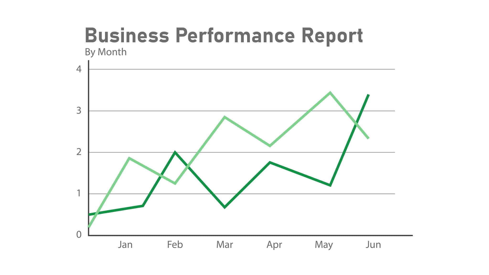
Quarter | Expenditure (₹ Cr) | Profit Margin (%) |
Q1 | 100 | 20% |
Q2 | 120 | 25% |
Q3 | 150 | 30% |
Q4 | 200 | 15% |
Question 16
What was the total profit earned by Company Y across all four quarters?
A) ₹110 Cr
B) ₹120 Cr
C) ₹125 Cr
D) ₹130 Cr
E) ₹135 Cr
Question 17
What was the percentage change in profit from Q2 to Q3?
A) 20% increase
B) 30% increase
C) 40% increase
D) 50% increase
E) 60% increase
Question 18
What was the total revenue (Expenditure + Profit) generated in Q4?
A) ₹215 Cr
B) ₹220 Cr
C) ₹230 Cr
D) ₹240 Cr
E) ₹250 Cr
Question 19
What is the weighted average profit margin percentage across the entire year?
A) 21.2%
B) 22.5%
C) 23.6%
D) 24.1%
E) 25.0%
Question 20
If the expenditure in Q1 of 2026 is projected to be 20% higher than Q4 of 2025 with a profit margin of 25%, what will be the projected profit for Q1 2026?
A) ₹50 Cr
B) ₹55 Cr
C) ₹60 Cr
D) ₹65 Cr
E) ₹70 Cr
Category 3: Pie Chart Questions
Set 5: Percentage to Value Allocation
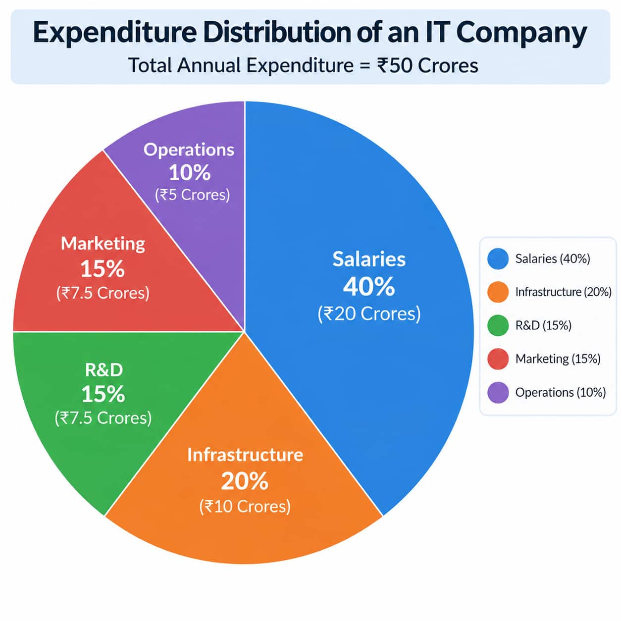
The pie chart displays the expenditure distribution of an IT company across 5 heads. Total Annual Expenditure = ₹50 Crores.
Question 21
How much money (in ₹ Crores) is spent on Salaries?
A) ₹15 Cr
B) ₹18 Cr
C) ₹20 Cr
D) ₹22 Cr
E) ₹25 Cr
Question 22
What is the absolute difference in expenditure between Salaries and Infrastructure?
A) ₹5 Cr
B) ₹8 Cr
C) ₹10 Cr
D) ₹12 Cr
E) ₹15 Cr
Question 23
What is the central angle corresponding to the R&D department in the pie chart?
A) 45°
B) 50°
C) 54°
D) 60°
E) 72°
Question 24
If Marketing expenditure increases by 20% next year while total expenditure remains unchanged, what will be the new expenditure on Marketing?
A) ₹8.0 Cr
B) ₹8.5 Cr
C) ₹9.0 Cr
D) ₹9.5 Cr
E) ₹10.0 Cr
Question 25
The expenditure on Operations is what fraction of the combined expenditure on Infrastructure and R&D?
A) 1/7
B) 2/7
C) 3/7
D) 4/7
E) 5/7
Set 6: Ratio and Sectorial Comparison
Dataset:
A publisher distributed 120,000 books across five genres.
Fiction: 30%
Non-Fiction: 25%
Academics: 20%
Self-Help: 15%
Children's Books: 10%
Question 26
What is the ratio of books distributed under Non-Fiction to Self-Help?
A) 3 : 2
B) 5 : 3
C) 4 : 3
D) 5 : 2
E) 2 : 1
Question 27
What is the total count of books under Academics and Children's Books combined?
A) 30,000
B) 32,000
C) 36,000
D) 40,000
E) 42,000
Question 28
By what percentage is the number of Fiction books more than the number of Self-Help books?
A) 50%
B) 75%
C) 100%
D) 125%
E) 150%
Question 29
If 20% of Academic books and 10% of Fiction books are hardcovers, how many hardcover books were distributed in these two categories combined?
A) 8,400
B) 8,600
C) 8,800
D) 9,000
E) 9,200
Question 30
What is the difference in central angles between the sectors for Fiction and Children's Books?
A) 36°
B) 54°
C) 72°
D) 80°
E) 90°
Category 4: Mixed Graph Questions
Set 7: Bar Graph + Table
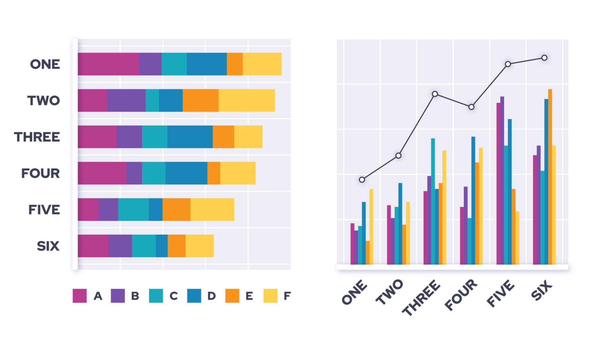
The bar graph shows total vehicles sold by five dealers (D1 to D5). The accompanying table provides the percentage breakdown of SUVs vs Sedans.
Total Sales: D1 = 500, D2 = 600, D3 = 400, D4 = 800, D5 = 700.
Dealer | % SUV Sold | % Sedan Sold |
D1 | 60% | 40% |
D2 | 55% | 45% |
D3 | 70% | 30% |
D4 | 45% | 55% |
D5 | 50% | 50% |
Question 31
Which dealer sold the highest absolute number of SUVs?
A) D1
B) D2
C) D3
D) D4
E) D5
Question 32
What is the total number of Sedans sold across all five dealers?
A) 1,380
B) 1,420
C) 1,470
D) 1,510
E) 1,550
Question 33
What is the ratio of SUVs sold by D3 to Sedans sold by D4?
A) 7 : 11
B) 14 : 11
C) 7 : 9
D) 28 : 33
E) 1 : 2
Question 34
Total SUV sales across all dealers form what percentage of total vehicles sold?
A) 52.3%
B) 54.7%
C) 56.2%
D) 58.0%
E) 60.1%
Question 35
If profit per SUV is ₹20,000 and per Sedan is ₹15,000, what is the total profit earned by dealer D1?
A) ₹85 Lakhs
B) ₹90 Lakhs
C) ₹95 Lakhs
D) ₹1 Crore
E) ₹1.05 Crores
Set 8: Line Graph + Pie Chart
Dataset:
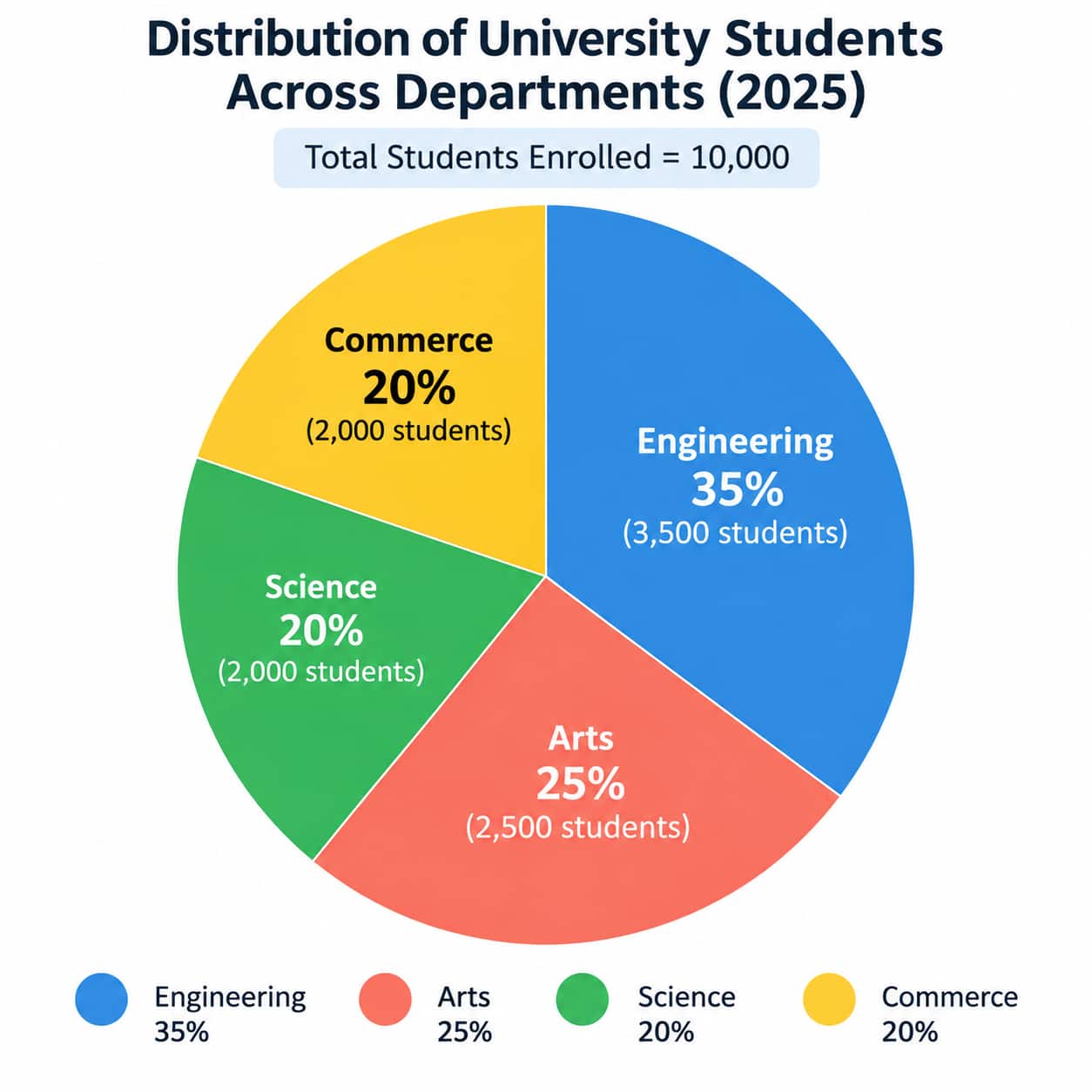
Total university students enrolled in 2025 = 10,000.
The pie chart gives the percentage distribution across departments:
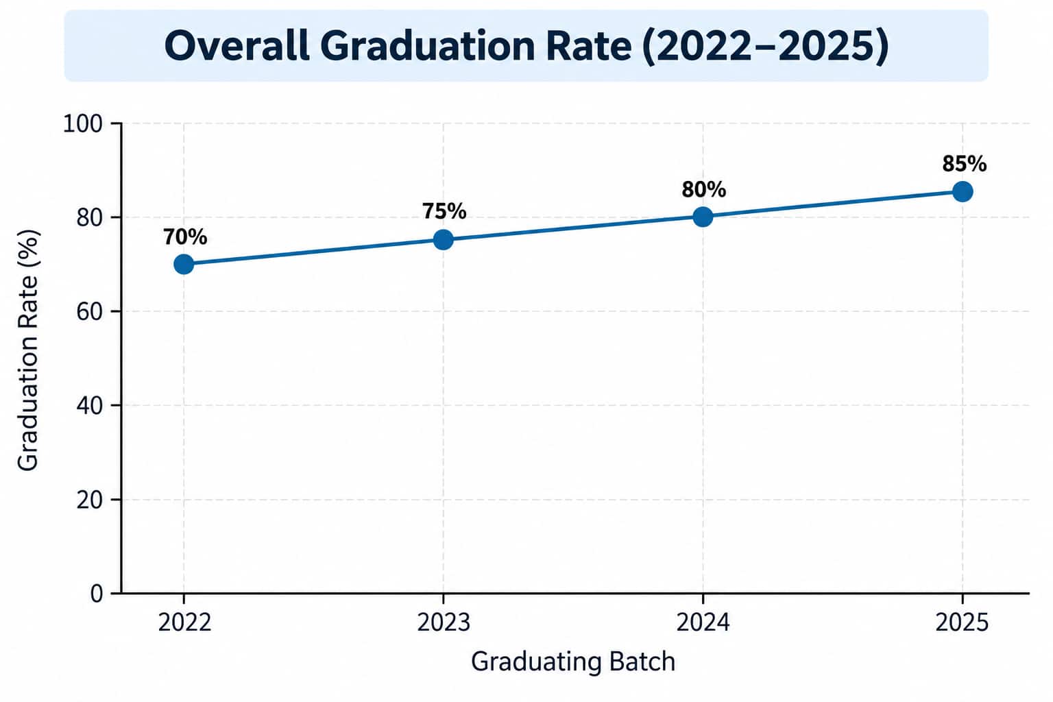
The line graph indicates the overall graduation rate (%) over 4 consecutive graduating batches 2022– 2025 ):
Question 36
In 2025, how many students are enrolled in Engineering and Science combined?
A) 4,500
B) 5,000
C) 5,500
D) 6,000
E) 6,500
Question 37
If overall university enrollment in 2025 was 10,000 and 85% graduated, how many students graduated in 2025?
A) 7,500
B) 8,000
C) 8,250
D) 8,500
E) 8,750
Question 38
If the graduation rate of Arts in 2025 was 80%, how many Arts students graduated in 2025?
A) 1,800
B) 1,900
C) 2,000
D) 2,100
E) 2,200
Question 39
If total enrollment grew by 10% each year from 2023 (8,264 students) to 2025 (10,000 students), what was the absolute number of graduates in 2023 (graduation rate 75%)?
A) 6,198
B) 6,320
C) 6,450
D) 6,600
E) 6,750
Question 40
What is the ratio of Commerce students in 2025to Arts students in 2025 ?
A) 3 : 4
B) 4 : 5
C) 1 : 1
D) 5 : 6
E) 2 : 3
Category 5: CAT-Level Comprehensive Graph Sets
Set 9: CAT DI Complex Set (Multi-Variable Set)
An e-commerce retailer operates in 4 regions: North, South, East, West.
Total Orders processed in 2025 =50,000}.
Regional Distribution (Pie Chart):
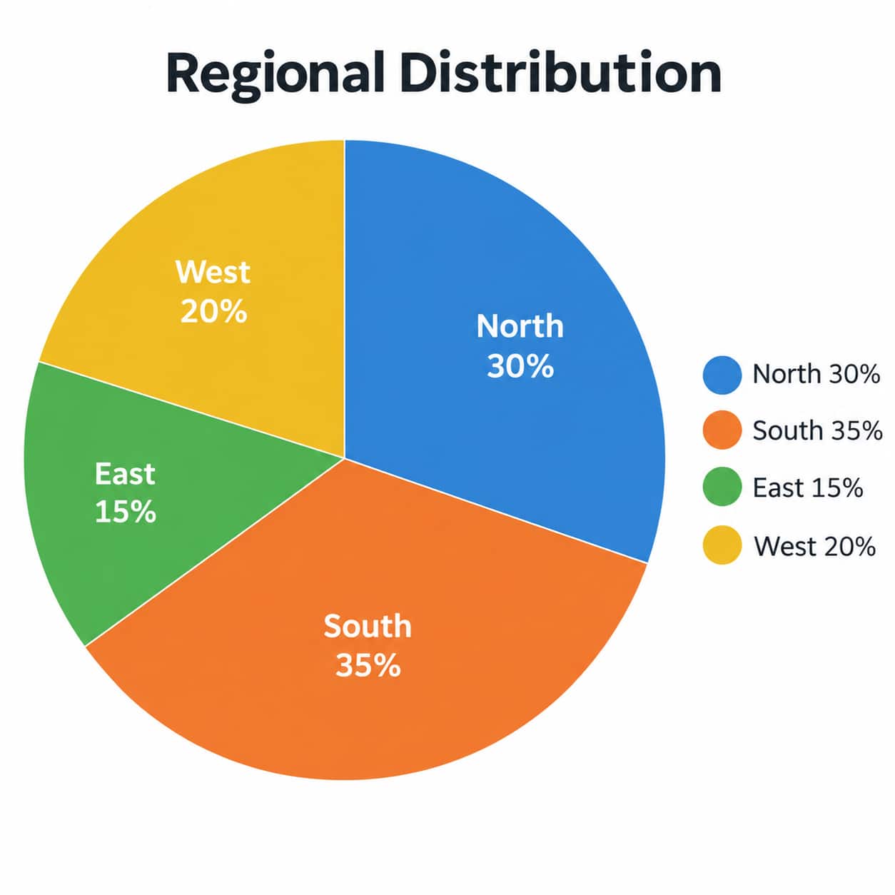
Fulfilment Metrics (Bar Graph Data):
Region | Returned Order % | Cost per Delivered Order (₹) |
North | 10% | 100 |
South | 8% | 120 |
East | 12% | 90 |
West | 15% | 110 |
Question 41
What is the total number of non-returned (successfully delivered) orders in the South region?
A) 15,500
B) 16,100
C) 16,500
D) 17,000
E) 17,200
Question 42
Which region recorded the maximum absolute number of returned orders?
A) North
B) South
C) East
D) West
E) Tied between North and West
Question 43
What is the total fulfillment cost incurred for delivered orders in the North region?
A) ₹13.5 Lakhs
B) ₹14.2 Lakhs
C) ₹15.0 Lakhs
D) ₹16.2 Lakhs
E) ₹18.0 Lakhs
Question 44
What is the overall average return percentage across all four regions combined?
A) 10.0%
B) 10.6%
C) 11.25%
D) 11.8%
E) 12.1%
Question 45
What is the ratio of delivered orders in the East region to delivered orders in the West region?
A) 33 : 34
B) 33 : 425
C) 66 : 85
D) 11 : 15
E) 22 : 25
Set 10: Graph-Based Statement Evaluation (CAT Logical DI)
Dataset:
The graph records quarterly operational metrics for three startup divisions (Fintech, Edtech, Healthtech) during 2025.
Division | Q1 Revenue (₹ Cr) | Q2 Revenue (₹ Cr) | Q3 Revenue (₹ Cr) | Q4 Revenue (₹ Cr) |
Fintech | 40 | 50 | 60 | 80 |
Edtech | 30 | 25 | 20 | 15 |
Healthtech | 10 | 20 | 35 | 55 |
Additional Information:
Profit margin for Fintech was strictly 20% in every quarter.
Edtech's customer base shrunk every quarter, but exact revenue per user is unknown.
Healthtech launched a new product line in Q3.
Question 46
Statement I: Fintech's revenue grew by 100% from Q1 to Q4.
Statement II: Healthtech experienced its highest quarter-on-quarter percentage revenue growth in Q2.
Which of the statements is/are correct?
A) Only I
B) Only II
C) Both I and II
D) Neither I nor II
E) Cannot be determined
Question 47
Is the total yearly profit of Fintech greater than the total yearly profit of Healthtech?
A) Yes, always
B) No
C) Equal
D) Cannot be determined because Healthtech's profit margin is not provided
E) None of the above
Question 48
Which division recorded the highest absolute increase in quarterly revenue between Q1 and Q4?
A) Fintech
B) Edtech
C) Healthtech
D) Fintech and Healthtech (Tied)
E) Cannot be determined
Question 49
Consider the following statements:
Edtech revenue decreased at a constant percentage rate every quarter.
Healthtech revenue in Q4 exceeded Edtech revenue in Q4 by more than 200%.
Which statement(s) is/are logically sound based on the data?
A) Only 1
B) Only 2
C) Both 1 and 2
D) Neither 1 nor 2
E) Cannot be determined
Question 50
If the overall target total revenue for the startup across all 3 divisions combined was ₹400 Crores for 2025, by what percentage did the startup miss or exceed its target?
A) Missed by 8.75%
B) Exceeded by 8.75%
C) Missed by 12.5%
D) Exceeded by 12.5%
E) Achieved exactly 100% of target
Best Resources to Ace CAT DILR Section 2026
CAT DILR is tough, but proper practice helps candidates to ace the basic concepts and practice easily. Get the download links of DILR ebooks for the CAT exam 2026 below.
Ultimate DILR CAT 2026 Guide: Concepts, Practice Sets and Detailed Solutions | |
CAT 2026 Mastery: Chapter-wise MCQs for Success for VARC, DILR, Quant | |
CAT DILR Questions with Solution, Download LRDI Questions for CAT Pdf | |
CAT 2025 DILR Masterbook - Practice 100 DILR Sets to score 90+ Percentile | |
CAT DILR PYQs Complete 5-Year Question Bank (2021 - 2025) |
Frequently Asked Questions (FAQs)
Q: What types of graphs are asked in CAT DILR?
A:
CAT DILR may include bar graphs, line graphs, pie charts, tables, and combination graphs. Questions can require candidates to compare values, calculate ratios or percentages, and identify trends.
Q: Are graph-based questions difficult in CAT DILR?
A:
The difficulty depends on the data and the number of conditions given. Most questions require careful interpretation and logical comparison rather than complex calculations.
Q: How should I prepare for graph-based DILR questions?
A:
Start by understanding how to read different graphs. Then practise questions involving percentages, ratios, averages, differences, and trends. Gradually move to mixed and timed DILR sets.
Q: Which calculations are important for CAT DILR graph questions?
A:
Percentages, ratios, averages, percentage change, fractions, and basic arithmetic are particularly useful. Quick calculations can help save time during the CAT exam.
Q: How much time should I spend on a graph-based DILR set?
A:
There is no fixed time for every set. Candidates should first assess the set's complexity and avoid spending too long on a difficult set. Regular timed practice can help improve speed and set selection.
Articles
Related Stories
|
Upcoming Mba Exams

Certifications By Top Providers
Explore Top Universities Across Globe
Popular Courses and Specializations
List of colleges accepting CAT
Browse Mba Colleges by State
Questions related to CAT
On Question asked by student community
Have a question related to CAT ?
Hello, CAT aur B-school entrance exams ke baare mein aap exam dates, eligibility, registration, exam pattern, syllabus, colleges ya admission process ki information dekh sakte hain. Aapki requirement ke according relevant details yahan mil sakti hain: https://bschool.careers360.com/exams
You can download the latest CAT syllabus from here:
Hey there,
For a B.Sc. with Chemistry, Botany and Zoology (CBZ), if the CAT application asks separately for:
- Degree Name: B.Sc.
- Graduation Stream: Science
- Discipline: enter/select Science if that is an available option.
If the Discipline dropdown has a more specific option such as “Biological Sciences,” “Life Sciences,” or “Zoology/Botany,”
Hey there,
Yes. With 2 years of work experience, you are eligible to target the regular 2-year MBA at IIM Calcutta as long as you have a bachelor's degree with at least 50% marks (45% for SC/ST/PwD). Work experience is not required for eligibility.
Which exam do you need?
For
Hey there,
For NIT Hamirpur MBA, the General-category CAT cutoff is not a fixed official percentile. NIT Hamirpur's 2026–27 admission process gives CAT a 10/10 weightage in the test component, followed by an interview; it accepts CAT, CMAT and MAT.
As a practical target, 80+ percentile is worth considering, while
Popular CAT Questions
Directions for question:
The bar-graph given below shows the foreign exchange reserves of Nepal (in million Rupees) from 2014 to 2021. Answer the following questions based on the graph :

Question:
What was the percentage increase (rounded to the nearest integer, if deemed necessary) in the foreign exchange reserves in

MBA/PGDM Admissions OPEN
Globally Recognized by AACSB (US) & AMBA (UK) | 18 LPA Avg. CTC for PGPM 2026
IBSAT 2026-ICFAI Business School MBA/PGPM 2027
ApplyGateway to IBS Hyderabad & 8 other IBS campuses | Scholarships worth 10 CR
Goa Institute of Management PGDM Admissions 2027
ApplyAmong top 6% B-Schools globally to be accredited by AACSB | Highest Package-35 LPA
NMAT by GMAC 2026
ApplyTest centres are available in 70+ cities across India | 75,000+ aspirants apply for the NMAT exam | Accepted by 58+ institutions like NMIMS, KJSIM, ISB, SPJIMR and Great Lakes.
ISBR Business School PGDM Admissions 2027
Apply400+ Recruiters | Highest CTC 17.2 LPA | Average CTC 8 LPA | 92% Avg. Placements | Ranked as Platinum Institute | Awarded Best Business School of the Year
Woxsen University MBA Admissions 2027
ApplyApplication Open | Scholars’ Round Deadline: 14th Nov’26 | Earn upto 50% merit Scholarship + 10% for top performers | EFMD Accredited | AACSB & Business Graduates Association Member | Highest CTC 28 LPA
CAT Notifications
Never miss CAT update
Get timely CAT updates directly to your inbox. Stay informed!